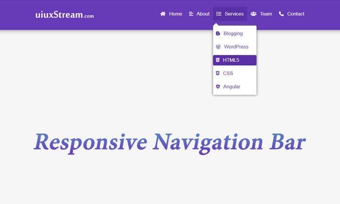
Responsive Navigation Bar With Dropdown Menus
A responsive navigation bar with the dropdown menu is created by using custom HTML, CSS, and jQuery. The responsive navbar is more beautiful with font-awesome icons, which work as menu indicators.
Here not require any Bootstrap or Foundation responsive front-end framework. You can make a responsive header or menu bar with a very small code.
Add HTML
<!DOCTYPE html>
<html lang="en">
<head>
  	<title>How To Create Responsive Navigation Bar With Dropdown Menus</title>
  	<meta charset="utf-8">
  	<meta name="viewport" content="width=device-width, initial-scale=1">
  	<link rel="stylesheet" href="https://use.fontawesome.com/releases/v5.10.2/css/all.css">
  	<script src="https://ajax.googleapis.com/ajax/libs/jquery/3.4.1/jquery.min.js"></script>
</head>
<body>
<!-- Start Header -->
<header>
    <div class="wrapper">
        <!-- Brand Image -->
        <a href="#" class="logo"><img src="/images/markuptag-white-logo.png" alt=""></a>
        <i class="toggle-btn fas fa-bars"></i>
        <!-- Navbar -->
        <nav class="nav-menus">
            <li><a href="#"><i class="fas fa-home"></i> Home</a></li>
            <li><a href="#"><i class="fas fa-align-left"></i> About</a></li>
            <li class="sub-menus"><a href="#"><i class="fas fa-list-ul"></i> Services</a>
                <ul>
                    <li><a href="#"><i class="fab fa-blogger-b"></i> Blogging</a></li>
                    <li><a href="#"><i class="fab fa-wordpress-simple"></i> WordPress</a></li>
                    <li><a href="#"><i class="fab fa-html5"></i> HTML5</a></li>
                    <li><a href="#"><i class="fab fa-css3-alt"></i> CSS</a></li>
                    <li><a href="#"><i class="fab fa-angular"></i> Angular</a></li>
                </ul>
            </li>
            <li><a href="#"><i class="fas fa-users"></i> Team</a></li>
            <li><a href="#"><i class="fas fa-phone-alt"></i> Contact</a></li>
        </nav>
    </div>
</header>
<!-- End Header -->
</body>
</html>
Let’s start, how to apply a responsive navigation bar to your project.
Note:- Here we have set the width of the small device 767px if we need more or less so we can change as required.
Add CSS
<style>
*{
    margin: 0;
    padding: 0;
    box-sizing: border-box;
}
body {
    background-color: #f5f5f5;
    font-family: arial;
}
header {
    background: #673AB7;
    width: 100%;
    float: left;
    box-shadow: 0px 0px 15px #777;
}
.wrapper {
    max-width: 1200px;
    padding: 0px 20px;
    margin: auto;
}
.logo {
    float: left;
    margin: 38px 0px;
    max-width: 200px;
}
.logo img{
    max-width: 100%;
}

/*-- Navbar CSS --*/
.nav-menus {
    float: right;
    min-height: 100px;
    display: flex;
    align-items: center;
}
.nav-menus li {
    list-style: none;
    position: relative;
    padding: 30px 0px;
}
.nav-menus a {
    color: #fff;
    position: relative;
    font-size: 17px;
    text-decoration: none;
    padding: 15px 12px;
    z-index: 1;
}
.nav-menus li:hover {
    color: #fff;
}
.nav-menus a:after {
    content: "";
    width: 100%;
    height: 0px;
    background-color: #5a30a5;
    position: absolute;
    top: 0px;
    left: 0px;
    border-radius: 4px;
    transition: 0.5s;
    z-index: -1;
}
.nav-menus li:hover > a:after{
    height: 100%;
}
.nav-menus i{
    margin-right: 8px;
    font-size: 16px;
}
.toggle-btn{
    float: right;
    height: 90px;
    line-height: 90px;
    color: #fff;
    font-size: 26px;
    display: none;
    cursor: pointer;
}
.nav-menus.active{
    display: block;
}

/*-- Sub Menus CSS--*/
.sub-menus ul {
    position: absolute;
    top: 80px;
    background-color: #fff;
    padding: 5px 0px;
    min-width: 150px;
    box-shadow: 0px 0px 8px #636363;
    border-radius: 4px;
    display: none;
}
.sub-menus:hover ul {
    display: block;
}
.sub-menus ul li {
    padding: 5px 0px;
}
.sub-menus ul li a {
    padding: 8px 10px;
    display: block;
    color: #5a30a5;
}
.sub-menus ul li:hover a {
    color: #fff;
}
.sub-menus ul::before {
    content: "";
    border-left: 10px solid transparent;
    border-right: 10px solid transparent;
    border-bottom: 10px solid #fff;
    position: absolute;
    top: -9px;
}

/*-- Responsive Menus Bar CSS--*/
@media (max-width:767px) {
.toggle-btn{
    display: block;
}
.nav-menus {
    position: absolute;
    width: 100%;
    background: #4e2890;
    top: 100px;
    right: 0;
    display: none;
    padding: 0px 15px;
    box-sizing: border-box;
}
.nav-menus::before{
    content: "";
    border-left: 10px solid transparent;
    border-right: 10px solid transparent;
    border-bottom: 10px solid #4e2890;
    position: absolute;
    top: -10px;
    right: 10px;
}
.sub-menus ul {
    position: static;
}
.sub-menus ul::before {
    display: none;
}
.nav-menus li {
    padding: 0px;
}
.nav-menus li a {
    display: block;
    margin: 15px 0px;
}
}
</style>
Add jQuery
<!-- Toggle jQuery for Small Devices -->
<script type="text/javascript">
    $(".toggle-btn").click(function(){
        $(this).toggleClass("fa-times");
        $(".nav-menus").toggleClass("active");
    });
</script>